Marked Improvement
Website Requirements
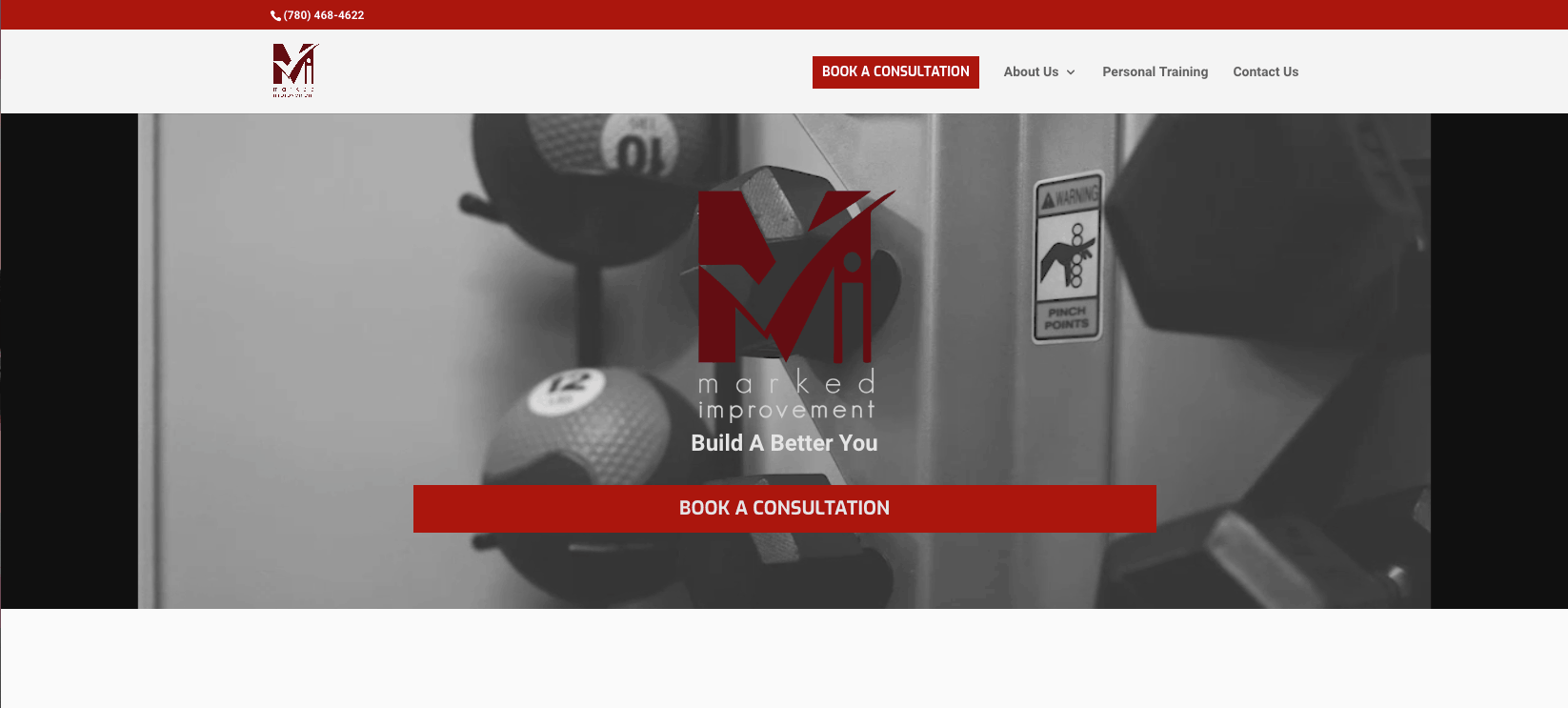
Marked Improvement was looking for a fresh and functional website that embodies the friendly and professional atmosphere of the gym. The site should showcase their trainers and training philosophy. It should have a focus on funnelling visitors to book a complimentary consultation.
The website should also give you a feeling of being inside the Marked Improvement training facility complete with private training rooms.
Website Approach
A header video was implemented to help showcase the gym as well as lots of images from inside the facility. Consultation booking links are spread throughout the site to funnel visitors towards the consultation booking page. Each trainer is highlighted in a meet the trainers section with a MindBody integration to see that trainers availability and book a consultation directly on the website.
A 360 virtual tour is implemented on the website to showcase the gym and give the visitors an idea of how the private studios are laid out. The 360 tour was created by Bryce Keller of Keller Visuals and embedded on the website.
Inspirational quotes are spread throughout the website that transition with a custom addon to swap out the quotes in the background without delaying website loading.
Results
The website has recently gone live. Stay tuned for the results.
